Ariel

Rozenbaum

Oakland (California)

(The United States)

Also serving:

San Francisco (The United States)

Minimum price

70$ for hours of work

Telephone

Contacts

Ranking

Senior Member

4 awards left until the Grand Member

5th place in The United States

With us

2 years

Studio Name

Milkshake Creative

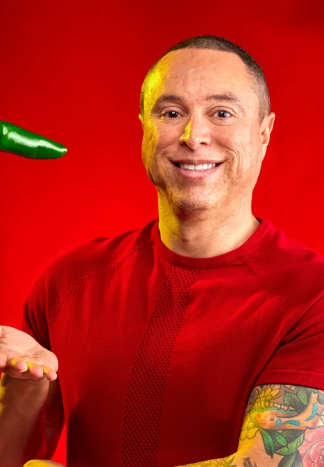
Starting out in video, I found my interest in food photography. With COVID-19 lockdowns in place, I found myself with nothing to shoot but food. Taking the variation that comes from any shoot and combining it with my passion for outdoor sports and movement, I most enjoy throwing food around and making it “float”. I guess mom didn’t quite instill the “don’t play with your food” creed hard enough!

Winning photos

I shot the bottle over a year ago but when I got to editing, the stock splashes and liquify layers were putting too much strain on my computer so I wasn't able to finish until I upgraded. I am happy that I waited since my original idea didn't include using the splashes as an "S" for Sia.

89th Collection

This is one of the shots I’m most proud of. I liked the roundness of the bottle and the gold cap, and I had been wanting to use these reflective gold coasters I found.
9 photo composite.

88th Collection

I liked the old style look of the syrup tin and wanted to incorporate it in a punchy photo; almost like graphic design rather than an actual photo.

87th Collection

I just wanted to produce a better photo than the ones available on the website. I saw them and thought, "c'mon, you can see the softboxes on that!"

86th Collection

I happy with the process on this one: I used a solid gold card for the liquid glow but blended it with a glittery gold card to add texture and give the impression of the background coming through for a more natural look.

86th Collection

This print was a wedding gift for some good friends; she likes bagels and cream cheese, and he loves ketchup. 8 photo composite.

84th Collection

Taking inspiration from cosmetics photography–specifically nail polish drips–I attempted this style with one of my favorite snacks as the "Snacks" title page for my cookbook, "Eat Like Ariel".

80th Collection

Thanks to @aduadus and @javiferagu for helping me with the splashes so I could stay dry and @d00dlebugg9 for joining my slogging editing sessions.

77th Collection

Using this textured plastic from @tapplastics I was hoping to create the sense of gloopy syrup as the background for this oh so gloopy syrup!

77th Collection

Thanks to @aduadus, @juliatomacheski, and @organize_edesign for ice cream, milkshake, and Kahlua wrangling. Shot for National Coffee Milkshake Day.

76th Collection

My first composite with a stock splash shot. Other than the splash, the tin itself is a 4 or 5 photo composite to use different reflections and highlights.

75th Collection

I bought this bottle for the shape and the color. I liked the large punt and how it looked through the thick glass, and the contrast of the golden whiskey, and white and blue label. I tried to complement the colors with a similar background: shining two gelled lights (orange and blue) through a textured piece of plastic. I'm happy with it, though next time I'll try adding some black card to give the glass some shape since it almost disappears into the background.

73rd Collection

This past August 25th, National Banana Split Day, I managed to obtain a special kind of banana. They aren't available at just any grocery store and are more often than not found in your photo manipulation program of choice.

72nd Collection

This was a collaboration between me (the photographer), my mami Andrea (the ceramist, @andrea.pottery) and Martin Hoellrigl of @capitolagardenfeast (the chef). This was one of my favorite shots of the collab; everything fell into place so well it almost feels like all I did was press the shutter!

71st Collection

I bought this bottle on a whim because I likes the shape of the label and the embossed accent. I tried to highlight them both in this photo. Originally I wanted a classic circular glow behind the bottle, but due to limited lights, I got this happy accident line: the top scrim casting a sharp line on the background quickly softening as it gets farther from the light.

71st Collection

This was a spec shoot for LifeAid, throwing cans into a shallow black tub with water. Their marketing was mostly bright and white and I wanted to see about providing a different look that was still desireable and refreshing.

70th Collection

I was apprehensive about this shot but I guess I shouldn't have been worried; at the end of the day, I always knew it Woodwork. Anyway, the great part about shooting drinks is that if it turns out, you drink to celebrate; and if it doesn't, you drink to forget.

69th Collection