One Hundred and Twenty-First Collection

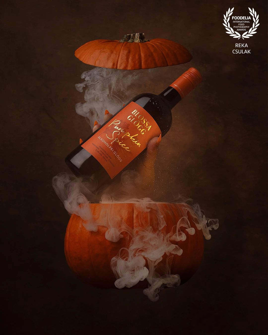
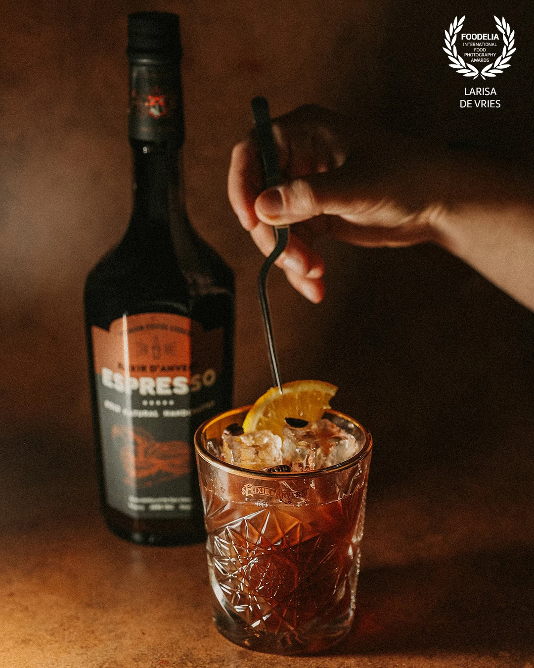
A lovely seasonal product by @blossasverige & @viinimaa with such an elegant label design truly deserves a touch of magic!

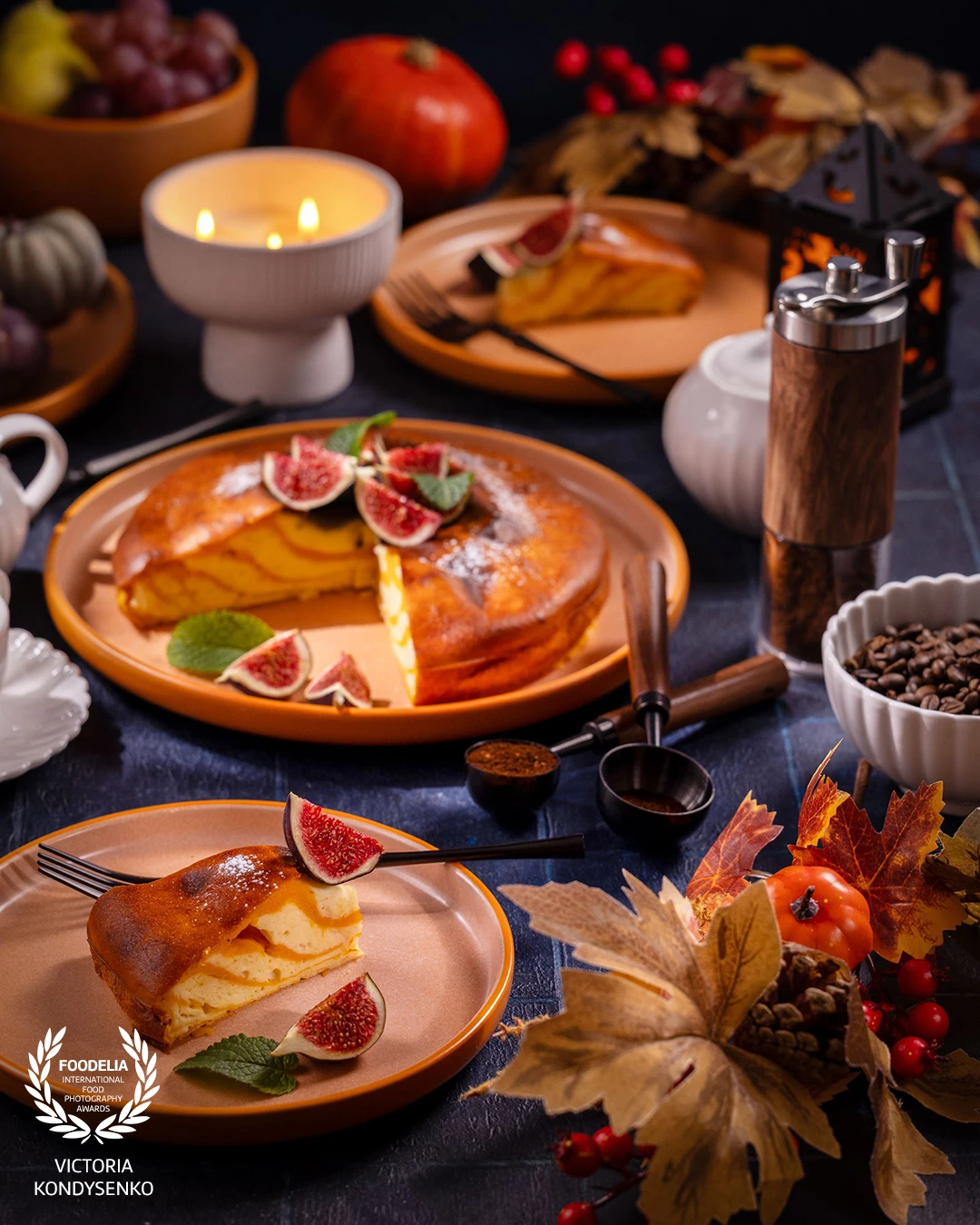
Autumn fig cake dessert. Celebrating autumn harvest with a delicious fig cake served with coffee, surrounded by warm candlelight, decorative pumpkins, and seasonal fruits on a festive table setting

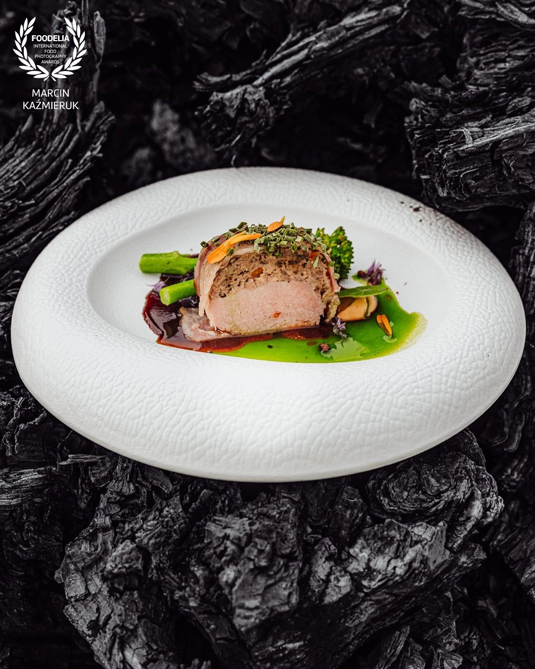
Dish created by chef Mateusz Szpytma
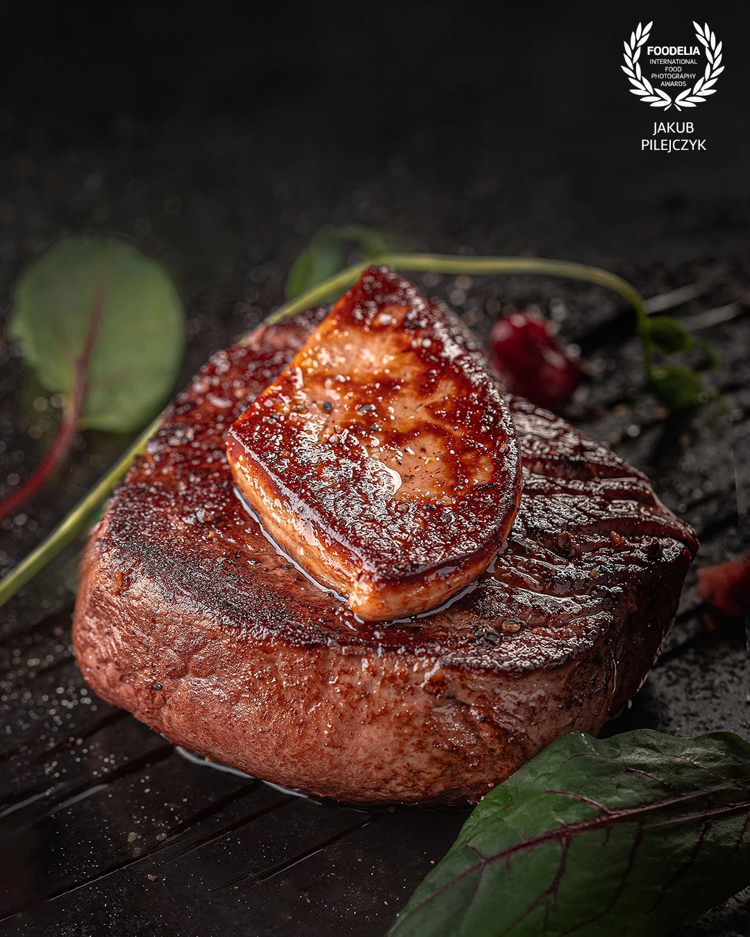
Wild boar loin with dry-cured ham, wild broccoli, demi-glace sauce and spinach oil
@marcin4funphotos
@szpytmamateusz
@fotofoodie
@boreczna #TakoGaleriaSmaku
@nikon_pl @nikoneurope @nikonusa @godox_global

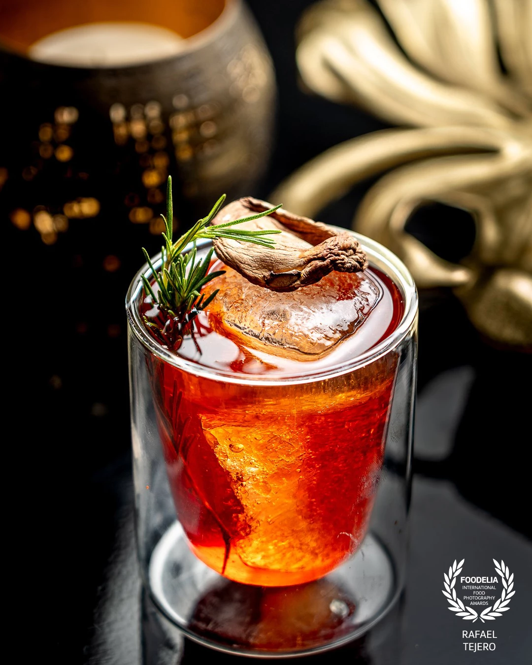
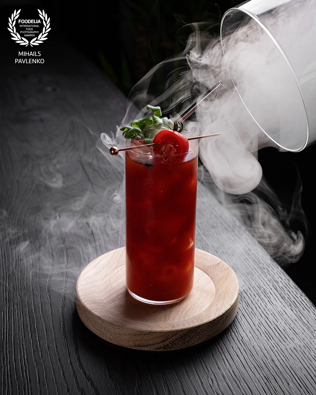
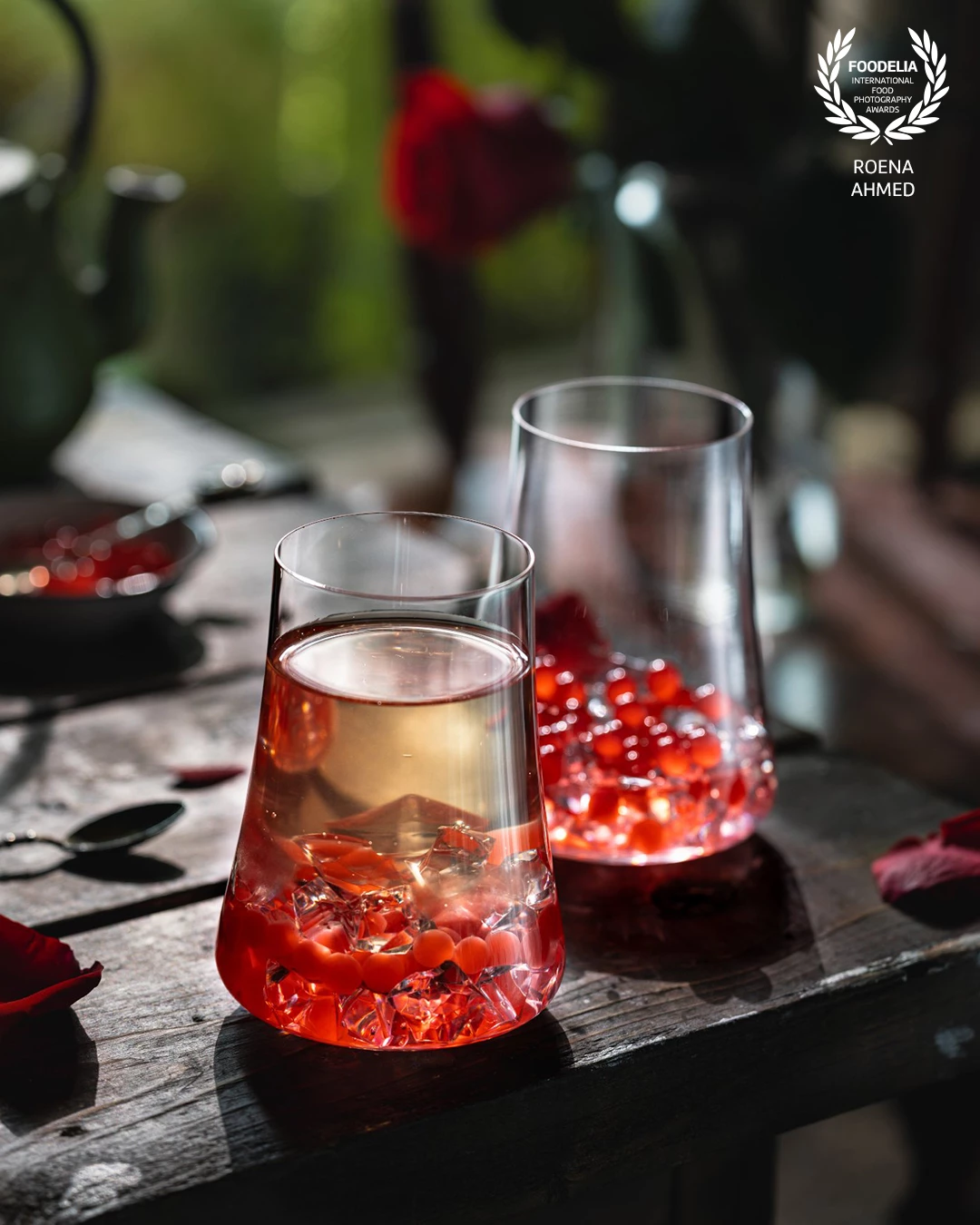
Capturing the essence of the restaurant using one of its reflective black tables, which contrasted with the reddish tones of the cocktail. In general, we try to avoid reflections in food photography, but here we were literally trying to achieve them.

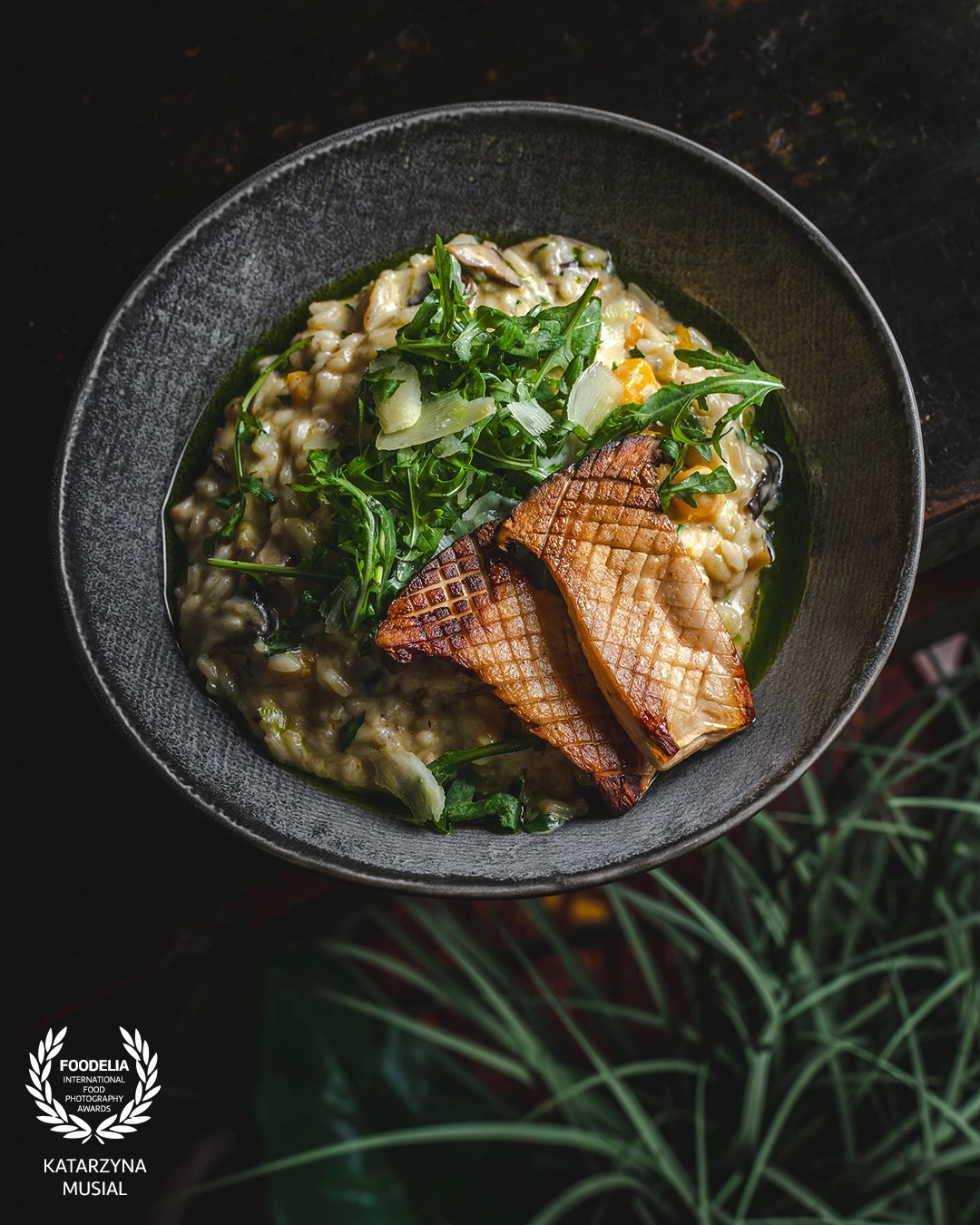
Earthy tones, creamy texture, and a hint of woodland aroma — where forest meets comfort. A bowl that tells a story of warmth, depth, and pure culinary soul.
for @mavericks.cracow.viennahouse


This crust, buttery, crispy, flaky and the filling, creamy, nutty with a hint of orange. I call it a perfect fall dessert! This Simple Pear with hazelnut Gallete is delicious.

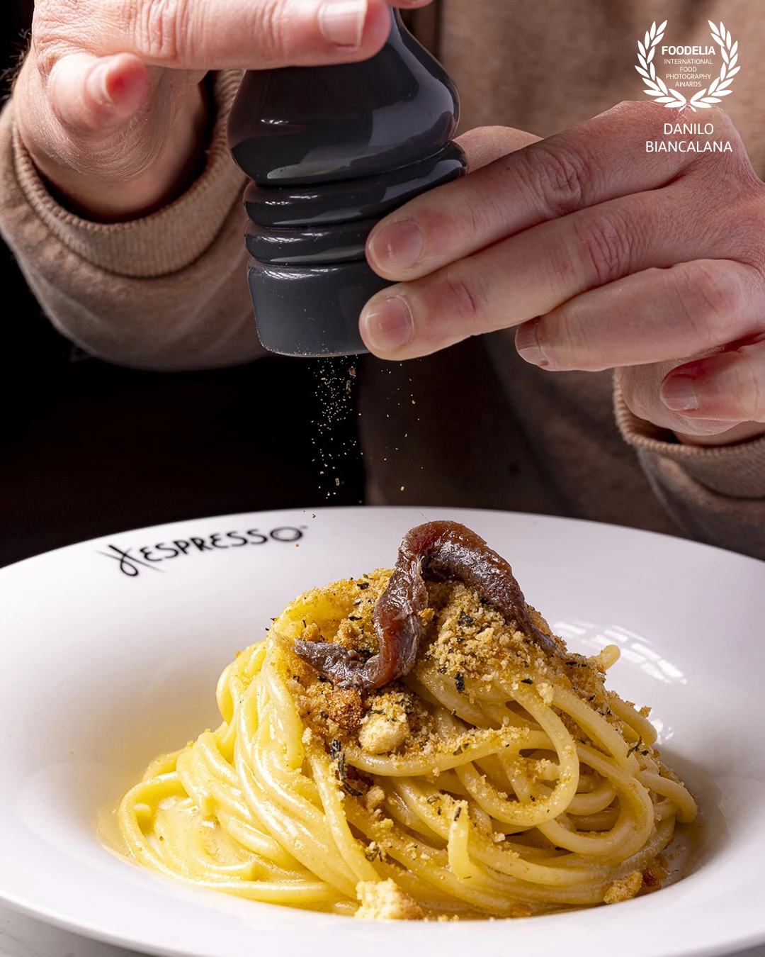
When, at Hespresso Ristorante in the center of Rome, a pasta becomes a work of Italian art, photographing it at its best becomes an enormous pleasure

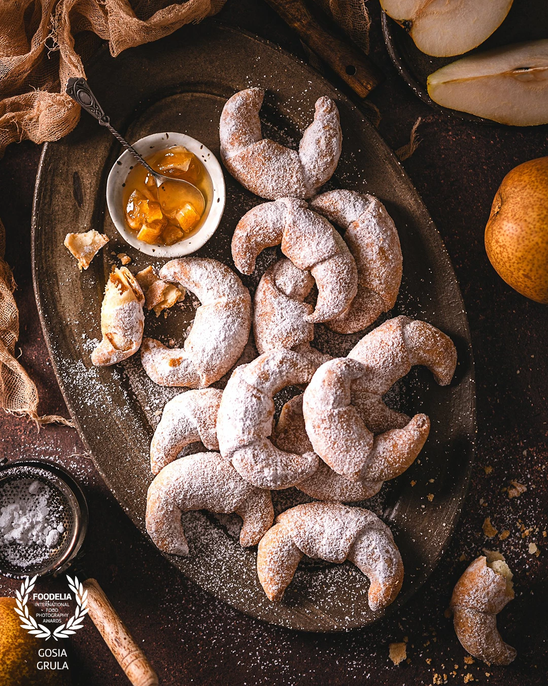
It wasn't my intention but this picture is a portrait of change of seasons - golden autumn meets the first snow.

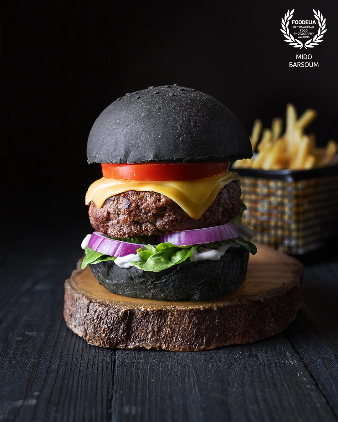
I was experimenting with how to dye bread black. I originally wanted to try squid ink or activated charcoal powder, to which I had no access, so I proceeded with black food coloring and the result was quite amazing. Since the subject is predominantly black on black, I thought to add a lot of vibrant colors in the fillings.

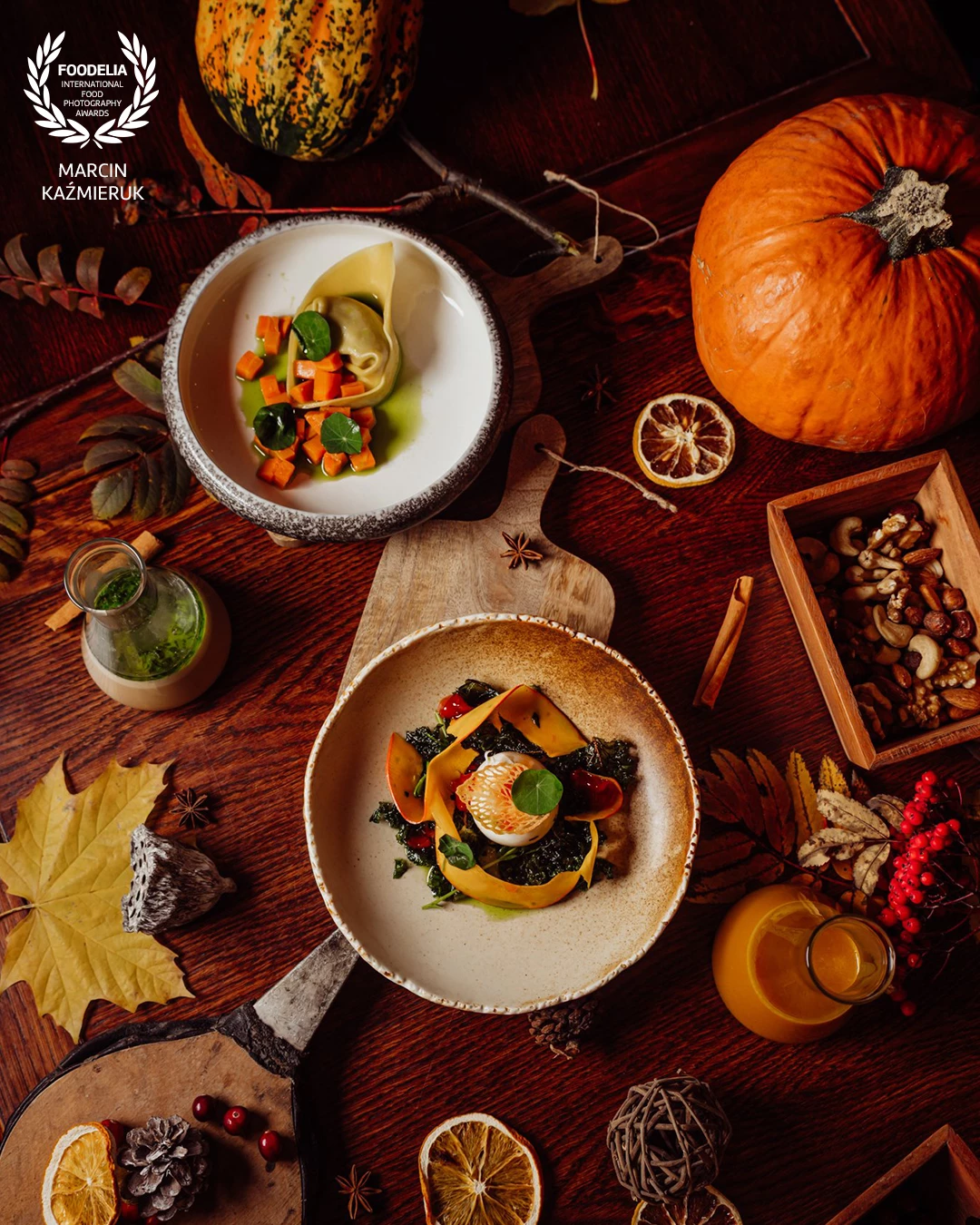
New Autumn menu @restauracjateatralna1 Michałowice - Poland
Mushroom soup / tortellacci with boletus / carrot / parsley oil
Creamy pumpkin soup
@pawelkucharski_ @kowalkamil1992
@dominikapodeszwa
@marcin4funphotos
@fotofoodie
@nikon_pl @nikoneurope @nikonusa @godox_global

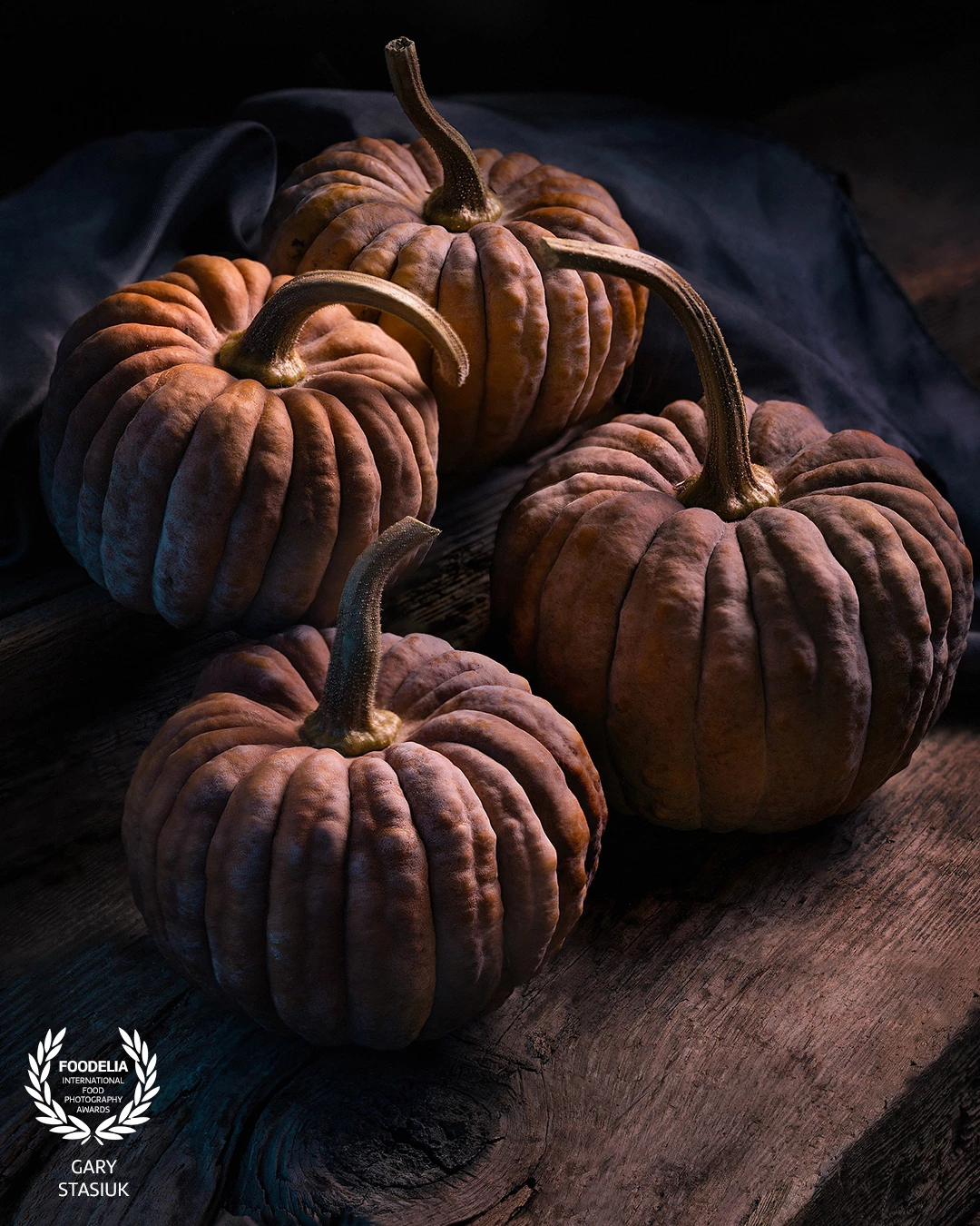
These mini 'pumpkins' were so evocative of autumn I was rather compelled to capture that vibe in a still life. I picked up these amazing pumpkin like gourds, grown locally, specifically for some moody halloween images for several ongoing clients.

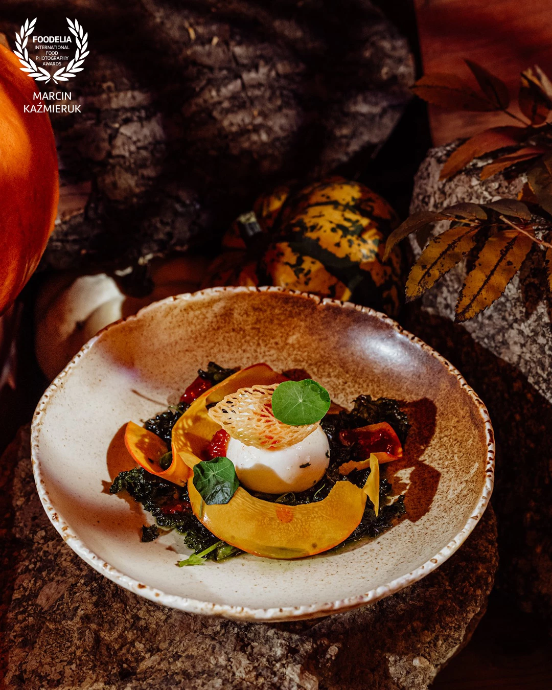
New Autumn menu @restauracjateatralna1 Michałowice - Poland
Pumpkin cream with burrata/kale/pepper jam
@pawelkucharski_ @kowalkamil1992
@dominikapodeszwa
@marcin4funphotos
@fotofoodie
@nikon_pl @nikoneurope @nikonusa @godox_global

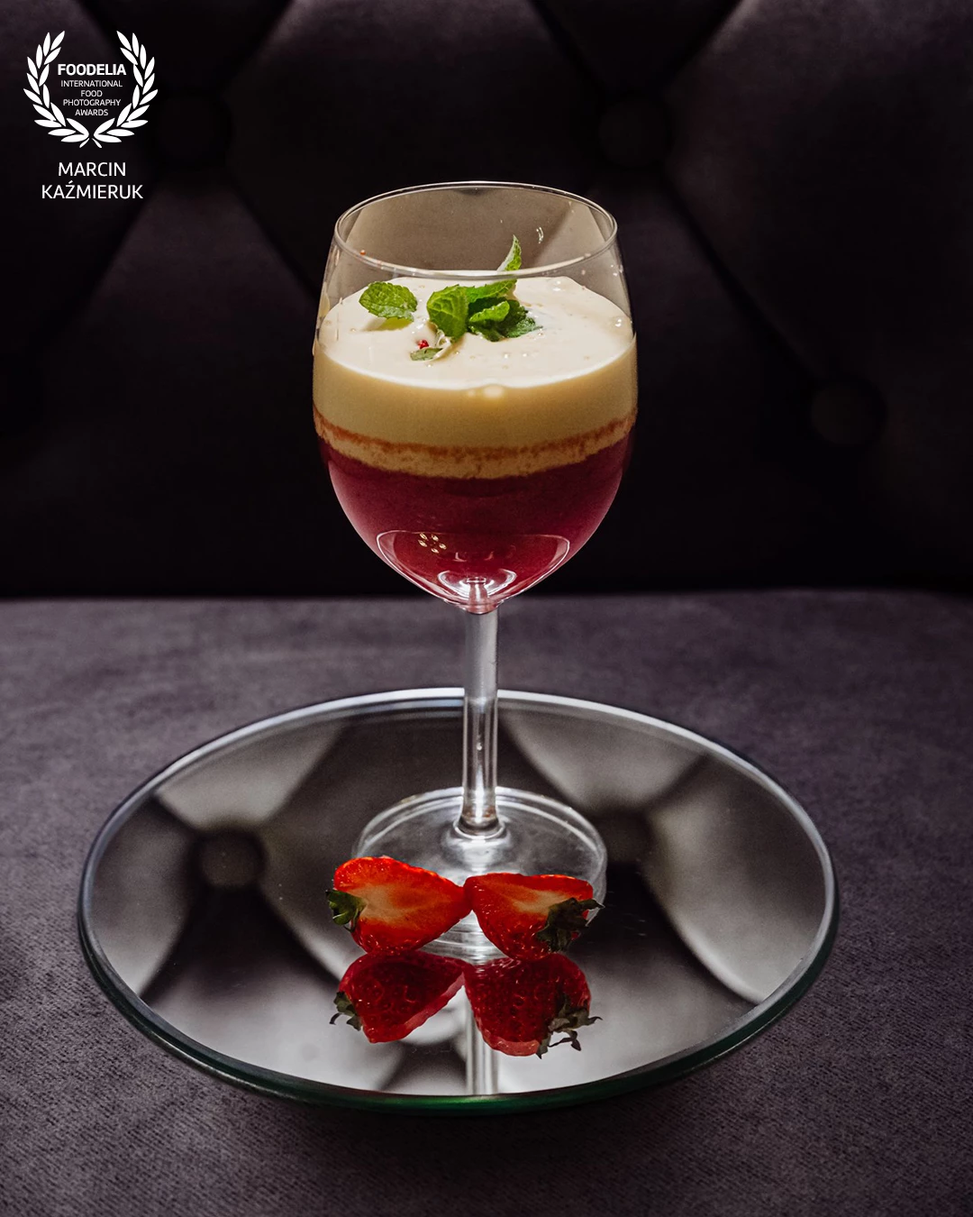
A delicious dessert at Hotel Buczyński ** Medical&Spa @hotel_buczynski_medical_spa
Zabaglione with strawberry mousse
@marcin4funphotos
@fotofoodie
@nikon_pl @nikoneurope @nikonusa @godox_global

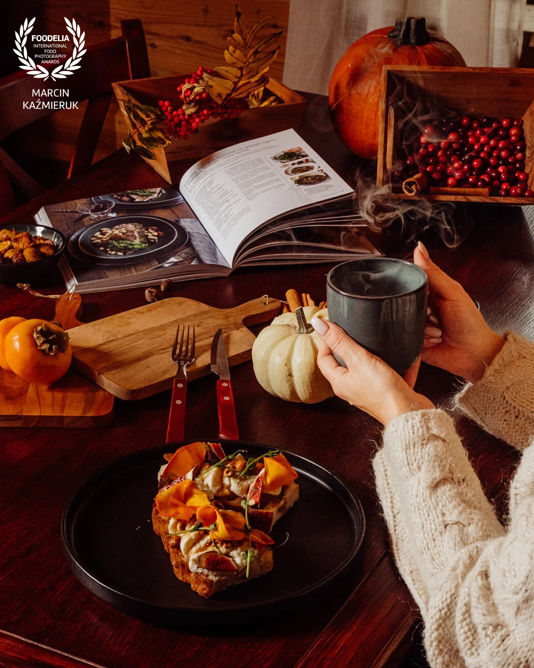
New Autumn menu @restauracjateatralna1 Michałowice - Poland
Focaccia / goat cheese Ritta from Łomnica / pickled pumpkin / figs / hazelnuts / buckwheat honey
@pawelkucharski_ @kowalkamil1992
@dominikapodeszwa
@marcin4funphotos
@fotofoodie
@nikon_pl @nikoneurope @nikonusa @godox_global

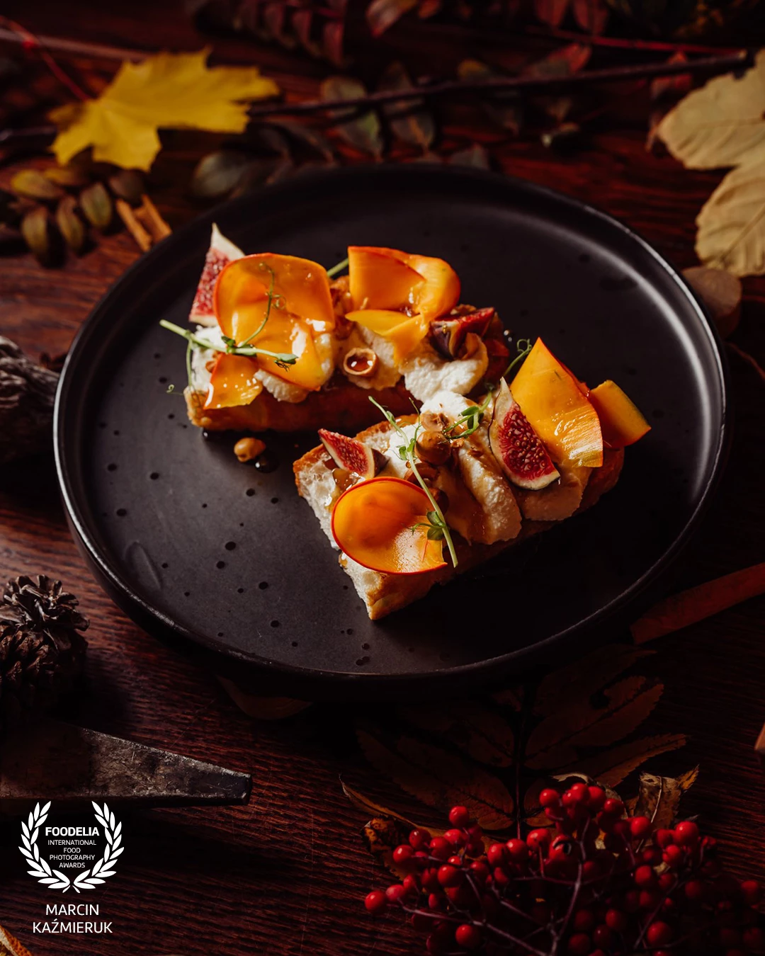
New Autumn menu @restauracjateatralna1 Michałowice - Poland
Focaccia / goat cheese Ritta from Łomnica / pickled pumpkin / figs / hazelnuts / buckwheat honey
@pawelkucharski_ @kowalkamil1992
@dominikapodeszwa
@marcin4funphotos
@fotofoodie
@nikon_pl @nikoneurope @nikonusa @godox_global

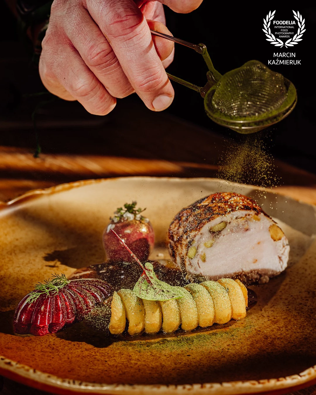
Photo taken during a plating workshop with the outstanding chef Ernest Jagodziński. He showed how to use beautiful Fine Dine plates to present some of the dishes.
On the plate we have pork loin with nuts/potato/fried beetroot/pepper sauce!
@marcin4funphotos
@chefstablebyernest
@ernest.jagodzinski.7
@finedineeurope
@gastrohouse1
@fotofoodie
@nikon_pl @nikoneurope @nikonusa @godox_global

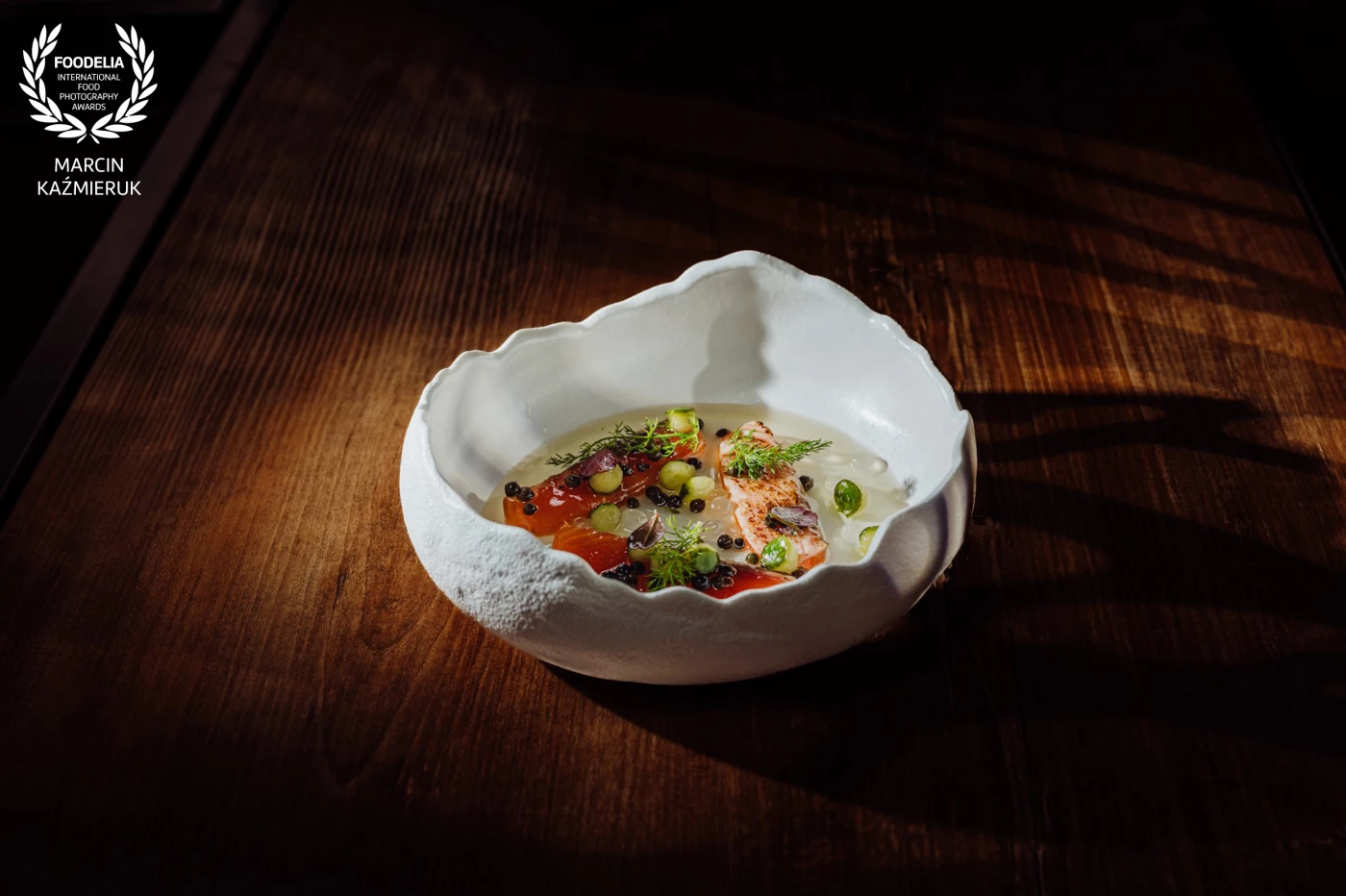
Photo taken during a plating workshop with the outstanding chef Ernest Jagodziński. He showed how to use beautiful Fine Dine plates to present some of the dishes.
Salmon marinated with kaffir lime leaves / elderberry and green peppercorn broth / cucumber / ponzu spheres by Yana Steudel
@marcin4funphotos
@chefstablebyernest
@ernest.jagodzinski.7
@finedineeurope
@gastrohouse1
@fotofoodie
@nikon_pl @nikoneurope @nikonusa @godox_global

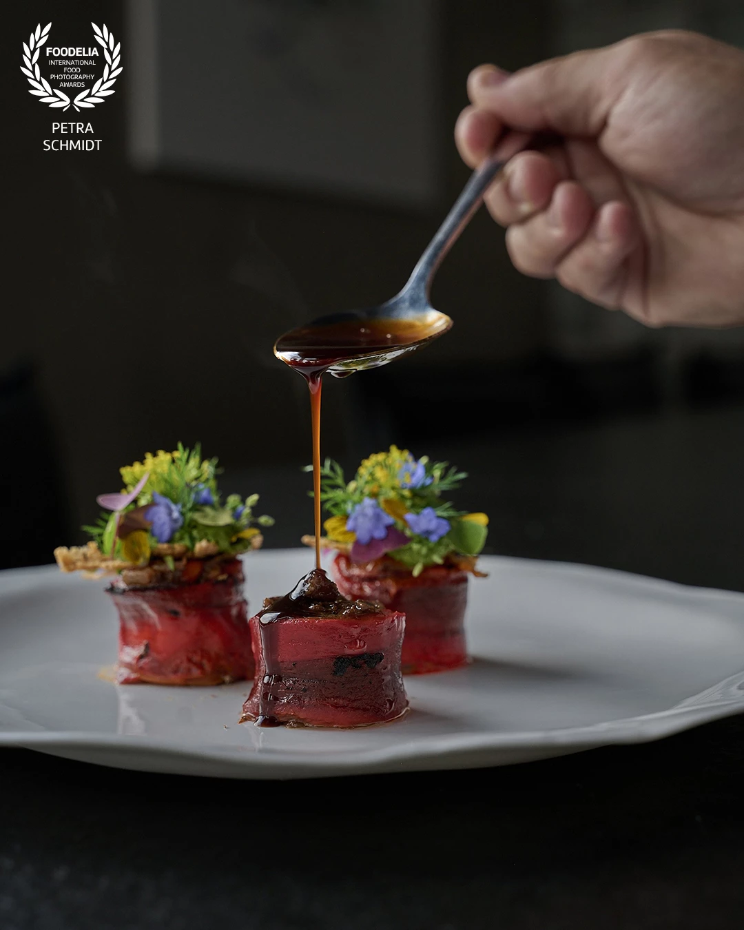
A slow-braised Wagyu Bürgermeisterstück, nestled in sweet pointed pepper — crafted by Michelin-starred chef Marcel von Winkelmann and beautifully staged in his restaurant. I had the pleasure of capturing this moment, where depth of flavor meets refined culinary storytelling. A dish that shows how Wagyu from Frankenhöhe transforms simple ingredients into something truly memorable.

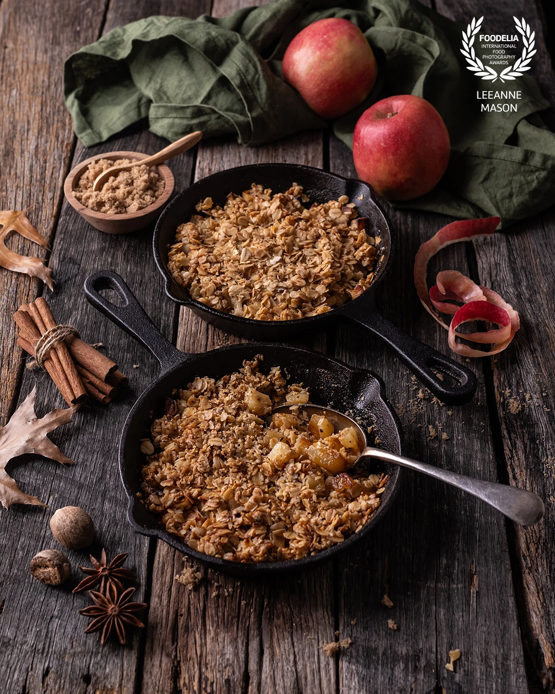
Delicious Apple Crumble with spices and all things nice! I lit this from the side with a large diffused light modifer. Keeping shadows creates an autumn mood along with some well placed props.

